nDI was recently contacted by Patrick Smacchia, one of the developers behind NDepend and he asked me if I’d like to try it out, which I did. This is a report of my first impressions.
If you’re not familiar with NDepend, it can be described as a tool to analyze a set of .Net assemblies for code quality. I suppose its name indicates that it originally was focused on analyzing dependencies but these days that name is rather misleading, in my opinion, as it can do much more that that. I’ll go through some of its capabilities below.
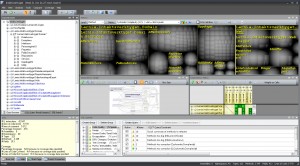
When you first analyze a set of assemblies, NDepend displays a screen similar to this:
If you’re like me, then you didn’t check out any tutorials or web casts before running the tool and your first reaction is likely “Holy cow! What’s all this?” or something similar. 🙂
It turns out that there is a ton of useful information in these displays but you have to know how to interpret them which takes a little learning.
Briefly, here’s what I gathered so far:
- The Metrics display (with the gray blobs) lets you select a metric (such as the number of lines of code) and display it on the selected code level (method, field, type, namespace or assembly). The the blobs represent code entities of the given level and their sizes correspond to the metric’s value. All children blobs of the parent level are grouped together to indicate which parents have high accumulated values of the metric. This display was really bewildering to me at first but once you decode its structure then it’s really powerful.
- The Dependency graph is more intuitive and let’s you see call dependencies between code components of different levels. Works well on small numbers of components but once you start to display larger dependency chanins, e.g. between methods, then it quickly becomes very difficult to use.
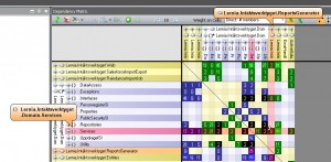
- The Dependency matrix is also fairly unintuitive at first, but very powerful.

It contains the so called Dependency Structure Matrix with displays dependencies between code elements. Each non-empty cell in the matrix represents a dependency but the number can have different meaning depending on user selections in the GUI. Green and blue cells indicate one-way dependencies (hover mouse over a cell to display a small arrow indicating the direction) while black cells represent bidirectional dependencies, which might be a cause for concern. This display can really show many interesting aspects of usage dependencies and it can also be used to generate dependency graphs for subsets of these dependencies (try the popup menu to see what I mean). - Finally, there the CQL query display where you can use the NDepend Code Query Language to further analyze your code. By default a set of standard queries are executed, listing potentional problems with naming, performance, and many others.
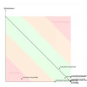
In addition to the displays described above, an HTML report is also generated after analyzing assemblies. It displays much of the same information as the graphical and interactive displays above, but also contains the “Abstract vs instability diagram”:
Obviously you want to be in the green area with all your assemblies, but the dimensions used might not be completely clear at first sight. This seems to be a good article describing it it detail.
So, what are my first impressions? Well, I must say that NDepend really is a very powerful tool for analyzing code but it does require investing some time to use its many features properly. To me, that seems like an investment well worth doing.
/Emil


1 thought on “NDepend – first impressions”